I am currently at the stage where I am refining my website for my minor project where I will be displaying my gifs.
Some of the feedback that I received from my classmates on my website when I initially published the first look of it was to play with the colour scheme of the website and consider some kind of logo or illustration.
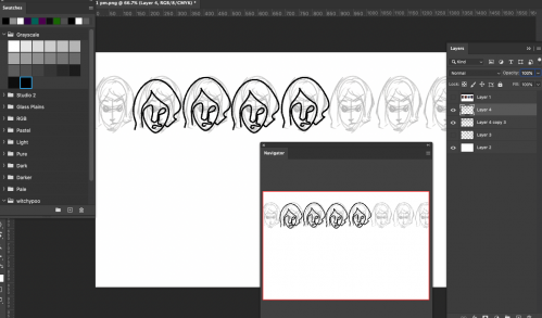
I began to design a background using a repetitive linart pattern that I designed based on the character face for the background, but once I tried to upload it, I realised that the theme template I had picked on Squarespace would not allow me to upload a background for the website. This led to a frustrating experience of trying to switch the template to a different style. However, Squarespace's recent update means that their policies do not allow for template switching on some of their new designs. This means that for the website that I have subscribed to, I cannot change the template style.
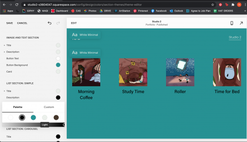
Since I have already paid for it, I decided to stick to my guns and try changing the colour and font themes instead.
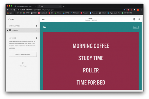
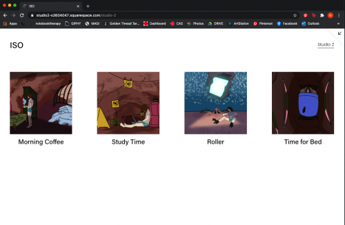
For the current draft, the homepage of the website comes up with the individual titles of each gif. The gifs appear on the screen when each respective title is hovered over with the cursor. I like this interface at the moment because it is inviting the user to explore each gif quickly one after another. It also gives a linearity to the story of the gifs that I think is vital to the experience of them.
I am currently waiting for feedback from my peers and some friends as well to get a sense of the user experience and see what may need changing.
About This Work
By Hattie Read
Email Hattie Read
Published On: 24/10/2020
tags:
AGI Studio 2, Studio 2, User Interface, Work in progress, wip, website, website design, squarespace, user experience


