Testing sub element colouring (Lines vs Shading)
In this test, I had a version with colour boxes attached to the Lines and the base separately, and another one with the shadows and the base separately. I decided that I liked the look of the shadow and lines shaded together instead.
Character Design Elements Separated
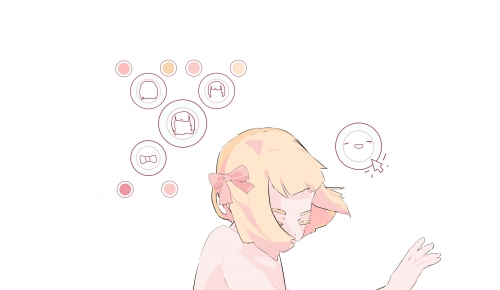
After deciding on the layer order, I had to pick the actual elements that would make up the character. I had to choose between 3 hair styles ranging from short to long, and between western and Japanese ghost outfits. I ended up going with the long hair and Japanese outfit because it fit the aesthetic and concept better.
UI variations Colour Picker
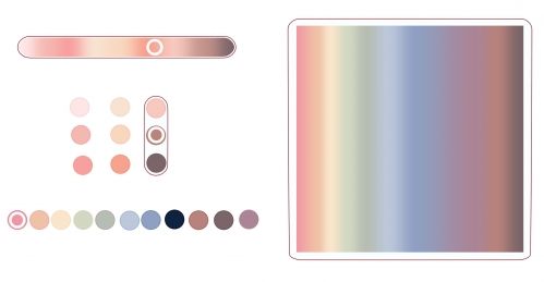
I experimented with 4 different types of colour picker options. The gradient types would allow the player to have more control and customization, but the colour circles will make sure they stick to the colour scheme
Colour Picker Full Box variations
With this game, I really want the player to have freedom with the colouring so I don’t want to restrict them too much in terms of colour. Thus, I decided to go with the square gradient box. This box still follows the pastel but low saturation colour scheme but goes from light to dark.
Colour Picker Skin Box variations
I also tried making a skin variant that also goes from light to dark for people to use when choosing the skin colour. However, these colours are already in the full colour box, so it might be a bit redundant and also limiting in case people wanted to experiment with more unorthodox skin colours.
More UI variations
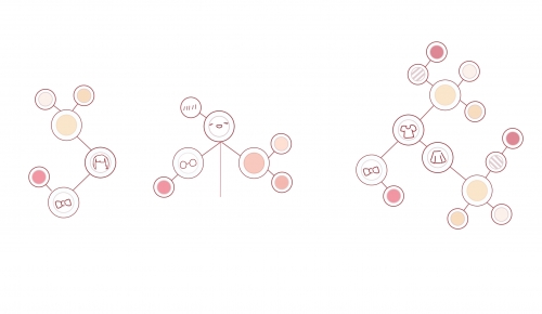
Since it would be too space consuming to have a large colour box on the screen, especially since I’ll be needing different boxes for different elements, I decided to have smaller UI circles that would open up the colour box and element selection box.
Upon more experimentation I decided to make it a network of interconnected circles that would open up one after the other when clicked or tapped.
This would help amplify the ‘clean’ look I’m going for.
Testing UI + full element colouring
This is the first test prototype I made with this code where I simply tried to change the colour of the hair element as a whole (linework, base and shading all together) and change the sprite of the hair it was very successful.
Testing sub element colouring (Base vs Lines & Shading )
For my next test, I tried to have the lining and shading as a separate element with separate colours. I decided this would be a better aesthetic option than colouring the entire element as one.
#kaykay #kkpppwk6


