
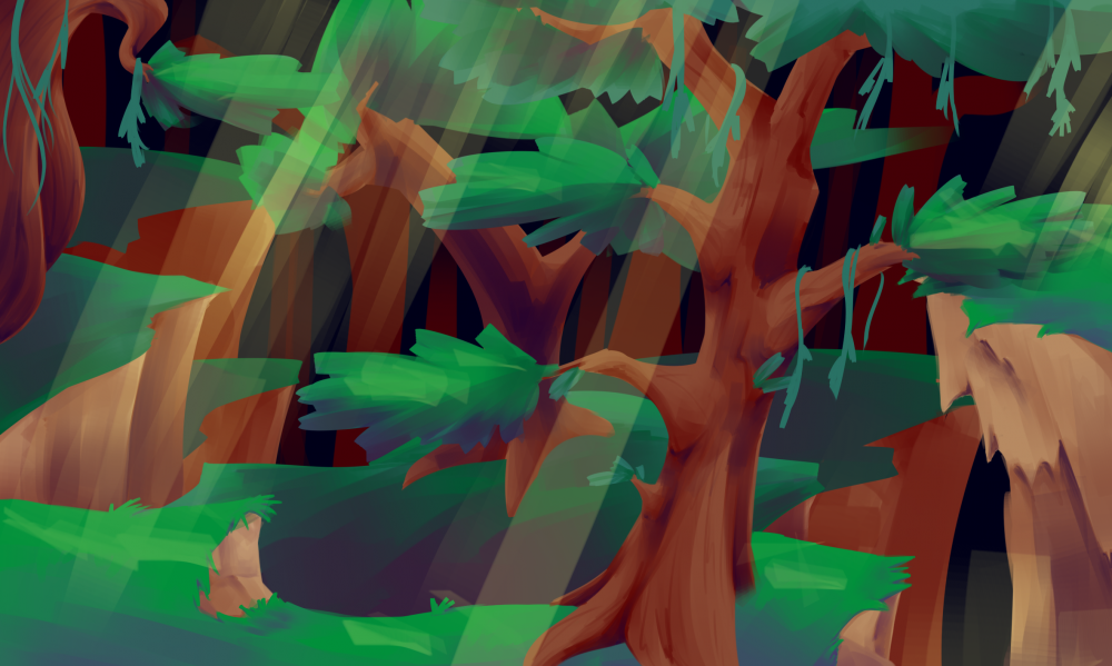
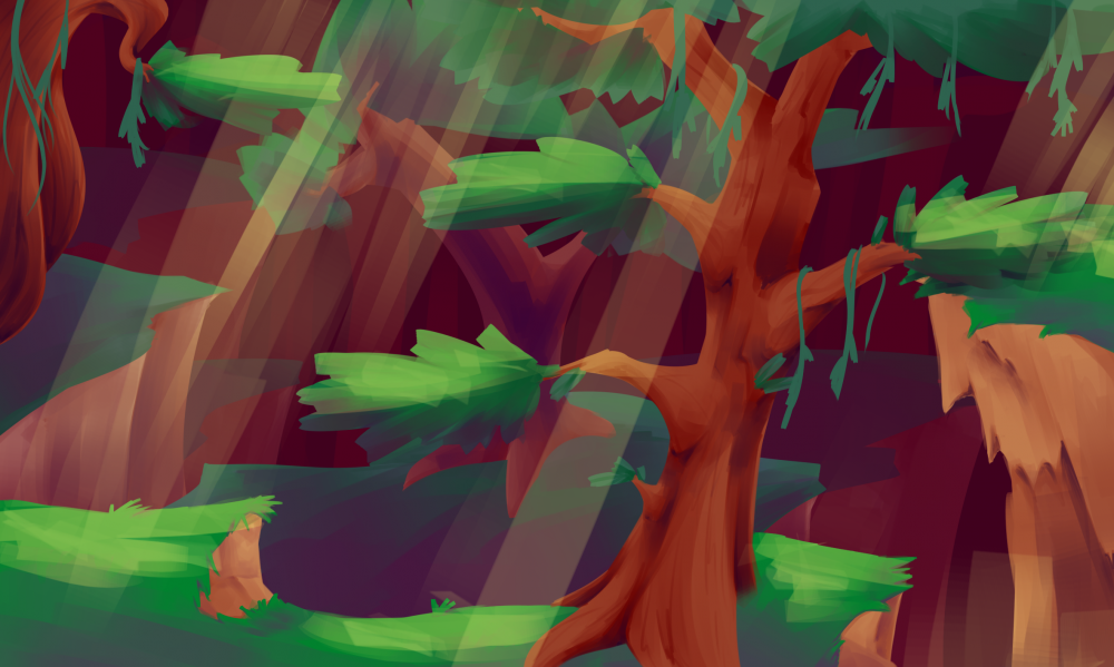
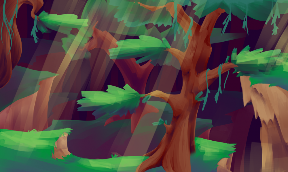
Messing around with colour palettes and overlays to try and get the foreground to pop. I have opacity layers over each layer of background, mimicking how things get hazy the further back you look. There is 4 layers, with three opacity layers in front of every layer except the foreground.
Concept 0 is with no overlays or opacity layers on the background.
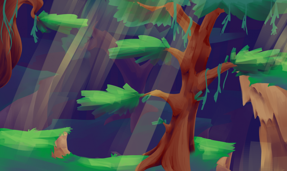
Concept 1 is with blue opacity layers on the background.
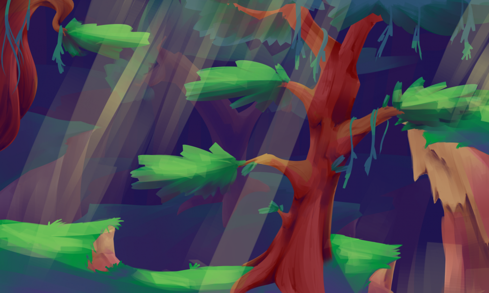
Concept 2 is the same as Concept 1 but with a purple overlay in some areas on the foreground, set at 35%.
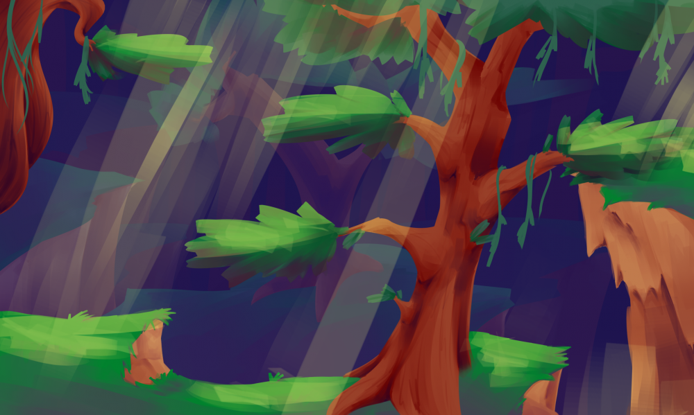
Concept 3 is with a red overlay over the whole foreground, set at 24%. I tried seeing how it would look with both overlays but it was too much. It had to be one or the other.
Concept 4 is the same as Concept 3 but with the blue over the first background set at a lower opacity.
Concept 5 is replacing the blue opacity layers with red.
Concept 6 is only replacing the first opacity layer with red, leaving the others blue.
Concept 7 is with a yellow overlay layer on the foreground, set at 50%. I don't know why the background is different though, it should look the same as above?
My conclusion with these experiments is that I'm still not satisfied with the result. Maybe I shouldn't go for a painted feel for this game, or at least stick to a medium that I'm more confident with. Usually games set in forests are so wonderfully magical, and use this excellently crafted painted look to a lot of them, but I feel I may be trying too hard to replicate that. Perhaps I'll try again, only this time with a brush I'm more comfortablet with using.


About This Work
By Sarah De Nardo
Email Sarah De Nardo
Published On: 15/08/2018