Week 8 Stasis and Stillness in motion
https://magistudio.net/work/iol-week03-s2-2022
IOL_week08_S2_2022
Context: For this week's topic, Stasis and Stillness in motion, I interpreted this week's topic more as a question of pacing in animation, which in Chinese means a picture in motion, but, animation, as it is known to the public, is indeed a sequence of frames put together. However, many animations choose to use stillness to show differences in mood or to highlight key shots. It seems to me that by designing appropriate still shots or adding slow motion to intense camera movement, the whole animation is paced more coherently and, loosely speaking, more specifically rather than uniformly. Many animations have very flat pacing of shots and a constant fast pace or too slow transitions can make the animation boring. Unfortunately, I seem to be facing this problem with my project, and so, using the spin-off of the Week 8 topic, I was able to think more deeply about and update this piece that replaced mine as well. In the first half of the semester, I focused on how to make the camera transitions more natural and fluid, while in the second half of the semester I will focus more on the pacing and colour effects of the whole film, shifting my attention more from the small details to the overall effect of the whole film.
This week's experimental clip:https://youtu.be/4QY-FM0xuq8
Reflective text:
During the week, I received feedback from Studio2 Folio1, in which my teacher mentioned that my animation transition was perfect, and I have to say that this was entirely due to the thematic derivation of IOL every week, which made me think more deeply about each shot and its various aspects of design. However, the feedback also mentioned that there were some problems with the timing of this project. In the consultation, the teacher pointed out that my pacing was relatively flat and kept distorting throughout the clip, and his advice to me was to adjust the rhythm of the animation. As early as the third week, during Nicolas' theme Timing, Tempo and Rhyme, I realised that there might be a problem with the pacing of my animation, that each shot was too flat. There was no contrast, but at that time, there were only clips and I thought that it would be difficult and cumbersome to go back to Toonboom's project file to adjust the pacing, and I couldn't do a better job of changing the I couldn't do a better job of pacing the whole film. However, with this week's IOL theme spin-off, I decided to face this issue again and was able to get a perfect way to adjust the tempo of the clips in Premiere.
The problem with the original version was that the pacing was too flat and there was no contrast between speed and slowness, which made the whole film look and feel bad. The film's pace could have driven the characters' emotions, especially as the film's main plot shows the protagonist's emotions going from ordinary to furious during a traffic jam before the light turns green and he enters a relaxed state. I thought that perhaps the film's pace could follow the main character's emotions, with the faster pace when he is more anxious and angry until the light turns green and then the pace slows down.
In the second version, I tried to adjust the tempo in Pr, using the simplest method of editing each clip and then changing the speed of each clip, but it didn't work well. I wasn't proficient with Pr, so I promptly went online to learn how to use Pr to adjust and edit time speed issues. After spending three days learning the ropes of Pr, I learned a new way to change the timeline using time remapping to add keyframes to control the pace.
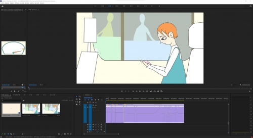
With the technical issues resolved, I officially moved on to tweaking the timing and in the third version, I tweaked the pacing. The main task was to adjust the tempo to the character's emotion, with the angrier the feeling, the faster the tempo until it starts to slow down again. I drew simple sketches of time speed lines to help with this.

![]()
(Develop speed with emotion of character)

(Work progress in Premiere-1)
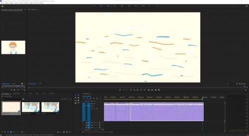
When changing the time speed, I still felt that the result was not very striking and a little confusing, especially as the pace was faster, the slowed-down parts were less noticeable, and some shots were a little jarring due to handling errors. Through IOL's theme this week, the element of STILLNESS was brought to my attention, so for the fourth version, I tried to find shots that could be stilled and that would fit into the whole film without being abrupt and also needed to have some effect on the emotional drive of the film. I also adjusted the speed curve to making the tempo changes more natural and used frame blending to render the footage where frames were lost, which made the footage look morenatural.
(Work progress in Premiere-2)
Related work
Chase,Chuchu Guo&Linbo Fei(2020)
The biggest thing that inspired me about this Chase film was how well it matched the pacing with the development of the plot. The pace is slow when the child chooses things, bringing out both the adults' expectations and the child's hesitation. On the other hand, when the adults force the child to choose what they want the child to choose, the pace starts to pick up. The child grows up fast, showing the kind of life of a child who is overwhelmed and can only be pushed by the adults very well, and allowing the audience to feel the sense of urgency and urgency more viscerally. The pace also gets faster towards the end, as the main character holds his child and tries to escape the control of the other elders until the pace slows down when the child finally settles on the abacus. Between the rush and the slowdown of the piece, the pacing, as one of the indispensable factors, provides great usefulness in driving the plot and bringing the audience into the mood. The author also balances the flow of the camera transitions, which gave me great inspiration and feeling. This film uses many classic timing rules, with key frames framed for more extended periods and then transitions as short as possible. I have tried to incorporate this excellent rule into my project, although the results are still not as good as they appear in Chase.
At the same time, in the many examples of timings I have reviewed and studied, it is possible to add interest to the animation by adjusting the spacing and adding secondary actions to the exact timings. As Yee once suggested, adding more shape to an object will give it a richer and more detailed look.
About This Work
By Xiying Yao (Eve)
Email Xiying Yao (Eve)
Published On: 06/10/2022

