week 7 - experiments in texture, light and colour
week 7 exercise video link >>click me!<<
꒰ method ꒱
-
I picked the scene with water overflowing from a cup to experiment on with texture, light and colour. It’s a main piece of animation in the scene that is constantly moving and changing.
-
First, I animated the object with a simple base colour of blue with a white outline which is similar to what I’ll be using in my final animation.
-
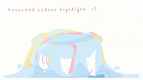
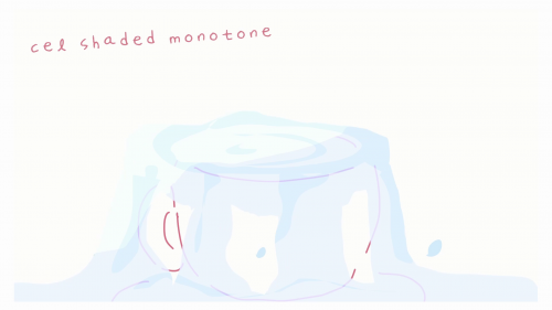
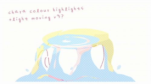
I tried to have different colour variations within the same colour scheme as the rest of my animation project. Then I tried different lighting effects on each of them. I tried a light gradient with the add effect and a shadow gradient with multiply, then tried two different hard cel-shaded alternatives for lighting, one exploring different colours as highlights and one focusing on the monochrome blue palette
-
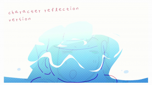
In terms of texture, I incorporated a dotted manga type texture to give the animation more character.
꒰ result / discussion ꒱
-
My initial intent was to explore ways to make the water look less flat and more interesting. Although I was only supposed to make 3 versions, I kept making more and more changes and trying different lighting styles and textures.
-
The dotted texture I used was really charming and it would be great to use it for the entire animation instead of this one clip. I tried sizing up and down the circles and finally decided on the perfect size for the texture.
-
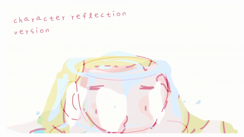
The character reflection texture and the colour highlights texture were two of the more creative takes I did on this clip and they helped me understand just how much artistic liberty I could take with animation. Although I wouldn’t use it for this particular scene, there’s a later scene of an overflowing bathtub that I could apply coloured highlights into as it contains the body of the girl.
#kaykay #kkiolwk7
