There is no fixed theme this week, so I continue to practice colors and textures.
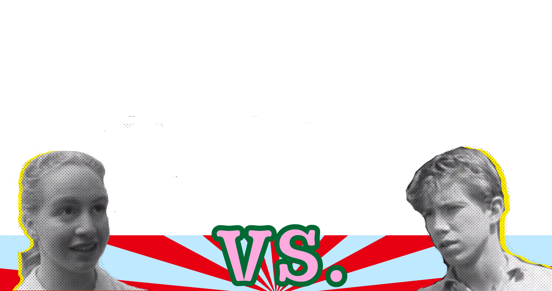
This week’s exercise is divided into two parts, one part is to make a game-style interface. This part is inspired by some street games. Because it is a battle between male and female protagonists, from an emotional point of view, I still chose complementary colors to make Interface. A comic-style halftone grid is added to the character's face to simulate the texture of the film.
The other part is to study retro TV-style filters. After investigation, I found that old TVs have some color casts. So I made a red and blue layer based on the RGB principle and added it to the video. For the texture, I added a bit of noise, come on Simulate the texture of retro TV shows.
The clip I chose is a bicycle clip without animation in the studio project because I don't want the colors added later to affect the presentation of the style.
Results and discussion: After the game interface is completed, my vision is to adopt the concept of stillness, the interface is static, with a moving picture. The experiment with retro texture is also relatively successful.
The final result is quite satisfactory to me, and eventually, I want to use it for the studio project.
Downloads:
-
Download File: -.mp4
About This Work
By Georgina Gui
Email Georgina Gui
Published On: 04/06/2021
