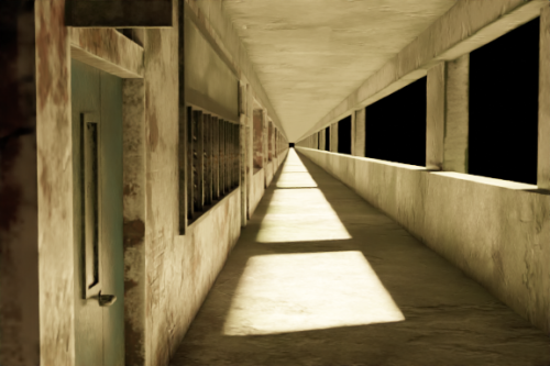
I chose the scene in the corridor outside the classroom,
and deliberately turned the background into pure black,
which was to make the picture artificial and unnatural,
and then designed the corridor as an endless extension,
which strengthened the theme of liminal space .
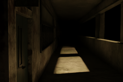
Then I adjusted the feeling of the space to gradually
darken the lens of the corridor, and made a gradient
animation to make the darkness slowly approach
to create a sense of oppression, but I found that this
method has the same problem as the above-mentioned
interior - limiting the threshold Threshold sense of
limited space. So I gave up on this practice.
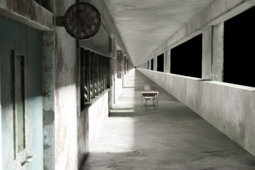
Then I added familiar elements that fit the scene: desks
and clocks. At the same time, I found that the clock
has a very strong sense of time threshold, so based on
this, I made an animation of lighting changes to make
the time slowly from morning to night Passing on until
darkness engulfs the classroom, it feels like I was a child
after school for some reason not being able to leave the
classroom in time and creating anxiety, this design has
received good feedback.
About This Work
By Huang Yangkai (Sam)
Email Huang Yangkai (Sam)
Published On: 24/10/2022


