
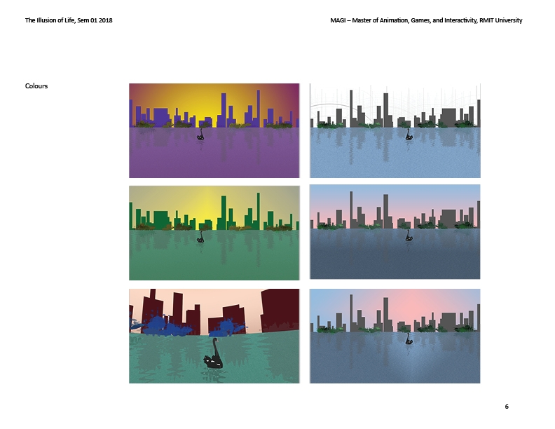
Colour Test A - Vibrant yellow and pastel pink
Colour Test B - Purples and yellows
Colour Test C - Greens and yellows
Colour Test D - Aqua, peach and burgundy
This exercise has helped me understand how a colour palette might come together. The process of making and reviewing different colour combinations opened up new ideas for how the this 360 space might look and feel. I'm still unsure of the colour palette, but I feel I've now got a pathway to establishing what colours will help communicate the concepts and mood for the VR experience.
Start
- Playing with colour combinations
- Designing things to be able to easily change colours
- Thinking about design that would give a greater sense of safety - can the viewer feel enclosed while able to look out to the distance
Stop
- Worrying about whether the colours work before I've even made the space, make first and then iterate through colour adaptations
Continue
- Exploring new ways of working that I can adapt for my process of creating