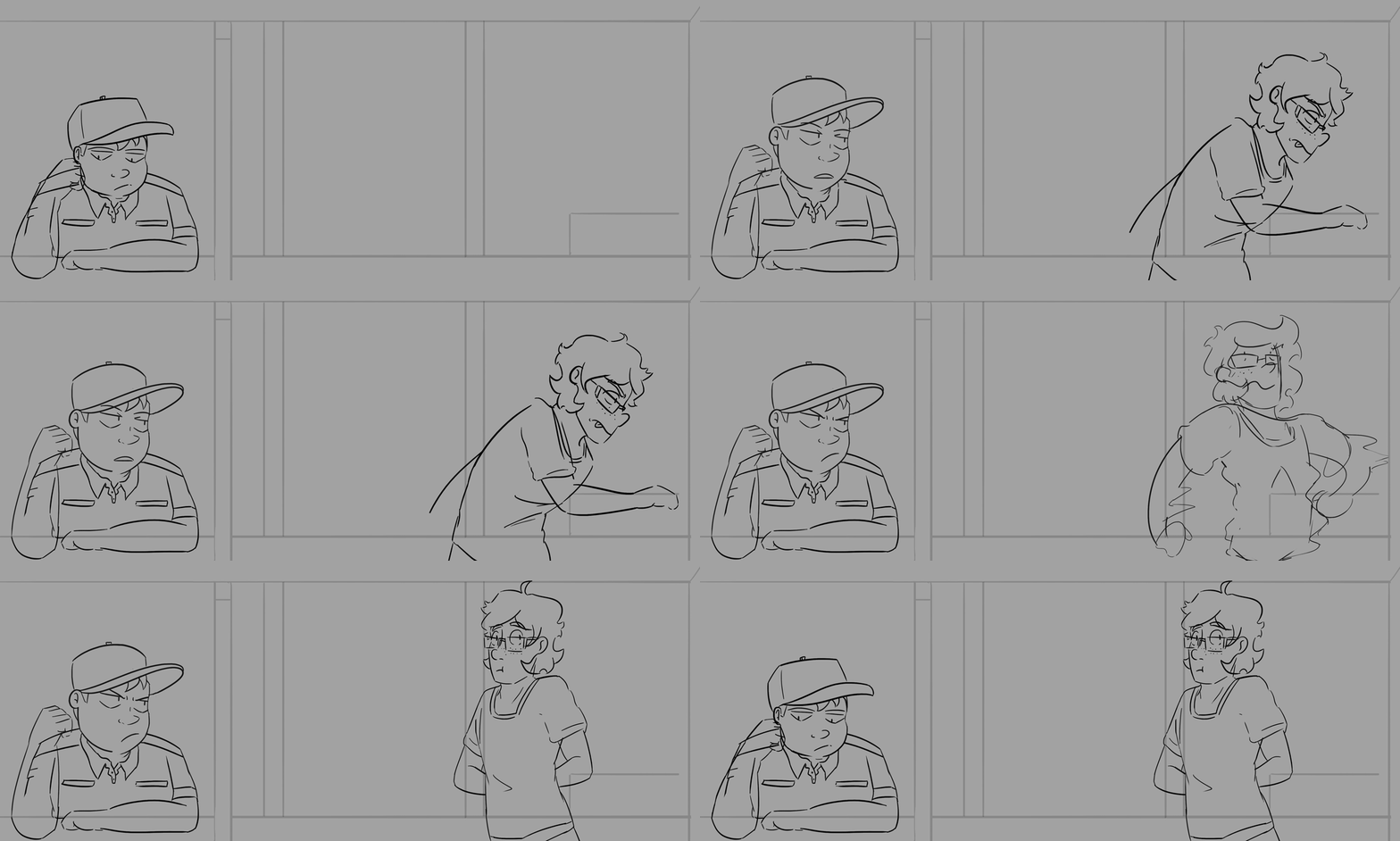
This week's experimentation was basically just iterating on the experiments I did previously!
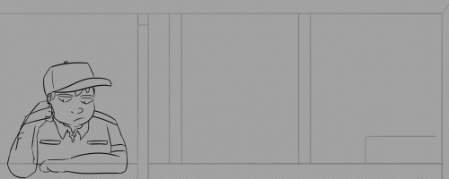
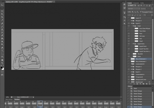
I begun linearting the "sneaking into the back room" scene, as well as some of the Cashier's individual gesture animations, as I am relatively happy with the timing of both. As such, most of this week's experiments were about workflow and
Some quick notes:
- I'm relatively new to animation, and currently lack a Harmony license. As such, I'm currently drawing + animating my scenes using Photoshop CS4.
- Before linearting these sequences, I exported each frame of my storyboard animations as individual .png files. This keeps the motion, while also cutting down on the amount of layers I have in any given document. Much easier to manage.
- Lineart is drawn at 300% resolution to the game itself, 'cause it's just... easier that way. Lineart will need to be shrunk down before colouring, otherwise there's ugly anti aliasing effects. (Learned that the hard way last year...)
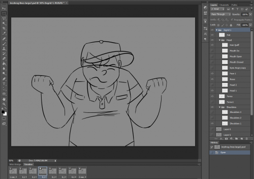
- Each top-level folder in the document = one character in one pose. Body parts are drawn on different layers, so they can be individually tweened to create bouncy animations.
- If a limb needs frame-by-frame animation and tweening at the same time, they get clumped into a subfolder (E.g.: Ingrid 1 > Arms 1). This makes it easier to keep the position of the limb consistent across frames, since you can just tween the whole folder at once and then toggle the individual layer/limb pose visibility.
- Once every final pose is lined, I chuck it together in the timeline to make sure everything looks good as its moved around. Sometimes this
- You might notice that some characters pop in/out of the scene, and that some gesture changes are hard cuts instead of fully animated. This is intentional -- the right side of the scene is not initially visible to the player, so the shopper appearing/disappearing isn't noticable.
The cashier's lack of animation in the second half is because those changes are blocked to the player clicking the mouse button.
Some quick notes on the "wtf bro" gesture animation document:
- My art style has drifted so much over the course of this project, I wound up redoing the Cashier's default pose. It seemed much easier than trying to keep the new animations in line with the old stuff.
- ...Particularly as those previous sprites were drawn at a different resolution that I did not write down, and I have no idea how to get my lines looking like that any more. Oops.
- It doesn't matter too much if lines of individual groups bleed into other areas -- in fact, it's probably better this way. Trying to get the lines perfect for one frame mean that they won't connect properly when retweened in the next frame.
- Plus once the head gets coloured, it'll block out the line connecting the shoulders together.
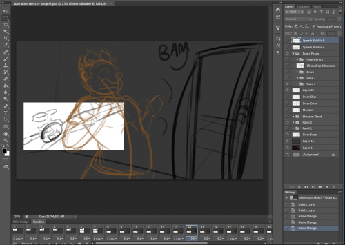
I also begun revising the posing/timing of the "slamming the door shut on the monster" cutscene.
- This document is primarily used to jot down the key poses, the position of visuals on the screen, and some very rough timing. It's about the flow of the scene as a whole, not fluid animation.
- Each panel is basically a mini-scene in itself, causing some huge filesize bloat. Each panel will need to be its own separate document, both to keep the number of layers managable and to stop my laptop from melting down.
- Oh also I haven't done terribly much with blocking in the monster yet, but I tried to add in a few more bits of subtle animation regardless; the cashier's hat falling off, the monster's hand clawing its way through the door, etc etc.
Finally, I had a crack at redesigning the dialog box to be something more akin to a dialog balloon. Pure white is much too bright for a game mostly set in dark rooms, so I haven't settled on a palette that looks good yet.
I also haven't had time to code those experiments into the engine yet. But! Speaking from past experience, it should be pretty easy to do.
About This Work
By Courtenay
Email Courtenay
Published On: 09/10/2020
