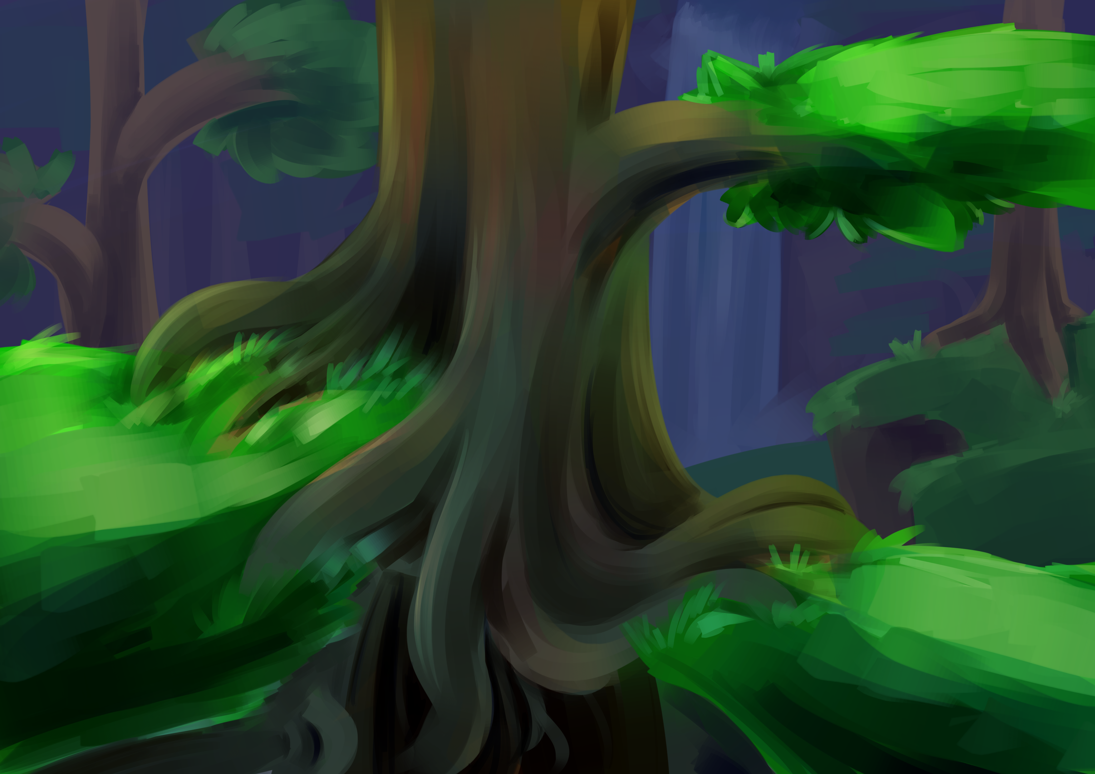
A painted environment to help get better with landscapes. I wanted to experiment with how well i can make a clear distinction between the foreground and background. This is a mock-up of a scene perhaps, and I wanted it to be clear which ways the player can go. It's supposed to be the brighter greenery as the area in which the player can actually traverse, but the fact that I feel the need to mention that probably means it still needs work. I tried making another overlay layer to make the foreground brighter again, but i still dont think it worked. I think it might just be too cluttered.
Also having it look dark while also keeping the foreground bright is hard to juggle.
About This Work
By Sarah De Nardo
Email Sarah De Nardo
Published On: 09/08/2018
academic:
mediums:
scopes:
tags:
Concept Art, level design, studio 1, Digital painting, level concepts, game design

