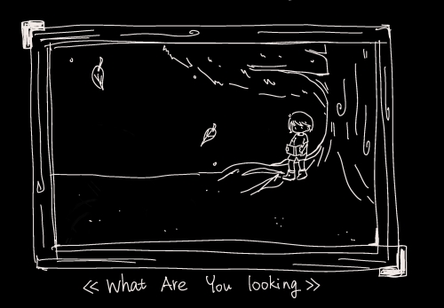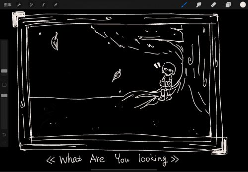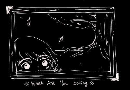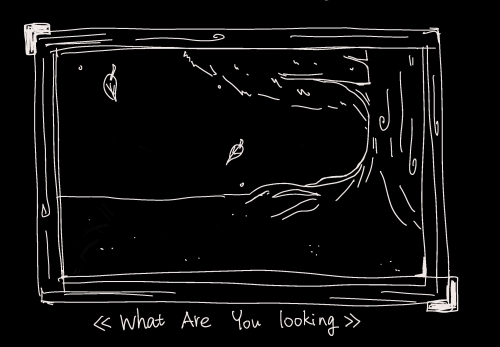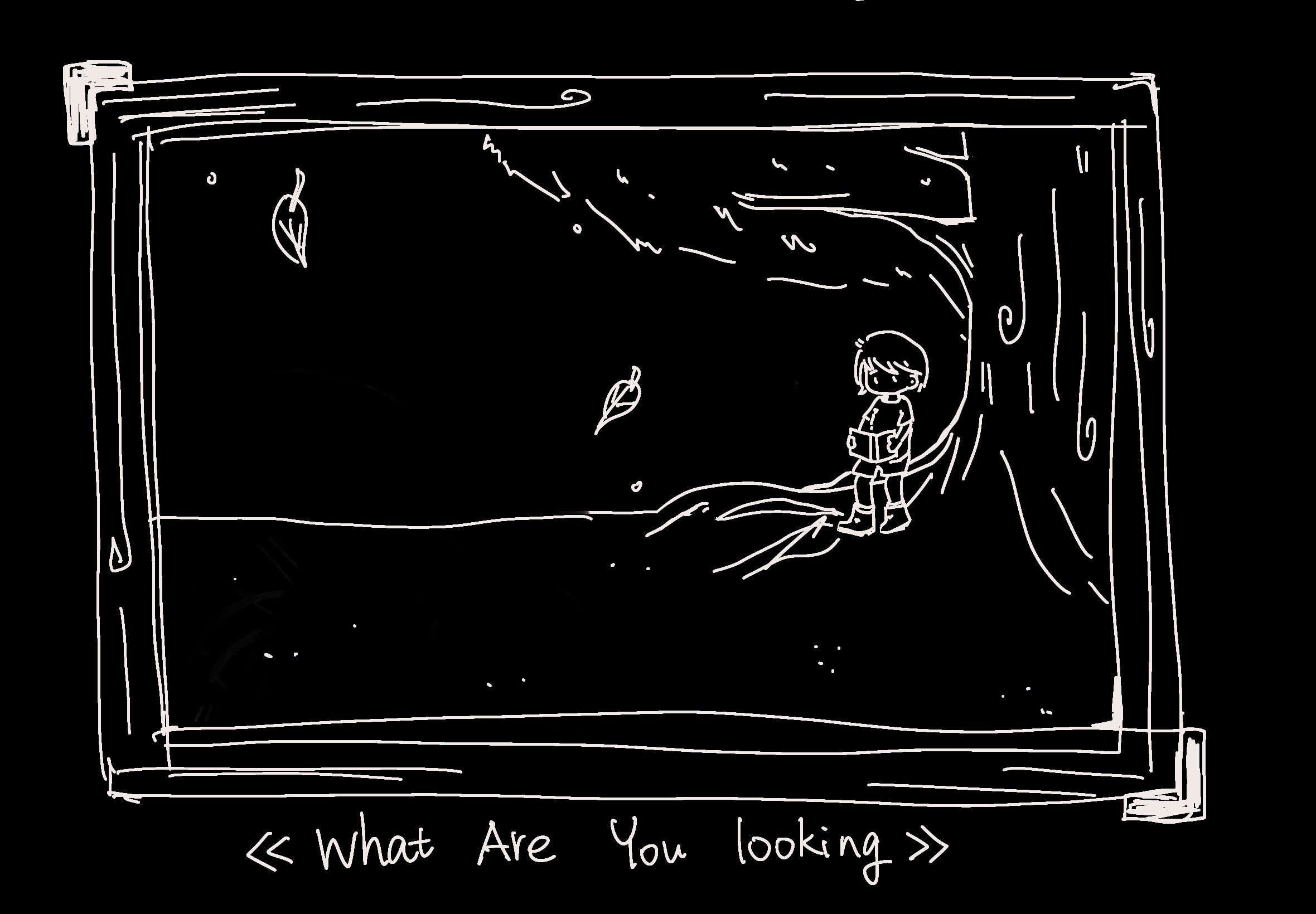
In response to this week's theme of limitation, I did a several comics around a boy who in the painting and final get out of the frame to the reality. This comic I named it as “What are you looking at.” which is double meaning that one is from the audience view to ask the boy that what book is he looking at, while when the view changed, it changed to be the boy and ask the audience what they looking at.
By doing this painting, I understand the different side view or different main characters can lead to different stories. And based on that, by always drawing the same stuff and practice new things, it is able to help the designer quicker find what they want.
my inspiration gets from a Japanese animation director, Hosoda Mamoru. He is famous for The Girl Who Leapt Through Time(2006), Summer War(2009) and Wolf Children(2012). As one of the most celebrated animation designer, he has unique creative characteristics and it can be seen in the bright color and simple lines. Besides, he is also known for the detailed description of emotion of the characters. In the below, I will introduce his design system into two parts: Story and Aesthetic.
Story:
A good animation design should be able to convey the story of the character to audiences, and to make audiences having their own thinking about the story. In a good story design, each story character (not necessarily perfect) has its own emotions, and there is no absolute good or bad. They may impact each other and in order to enrich the story. Based on that, the animation story should be multilayered. A good animation design should enrich the story from the details.
Aesthetic:
Because of Hosoda Mamoru’s own job experience, his art style is impacted by the Studio Ghibli in a large extent. He worked for Princess Mononoke(1997) and other works as an art designer and supervisor.
His works are simple and clear, the characters in his animation film do not have a large area of light and shadow contrast, even there are no shadows for most characters, which emphasizes the changes in the facial expressions of the characters, but also makes the characters appear very flat. This kind of no shadow art style can be seen in Alfons Mucha as well.
The art design of the overall animation is to serve the story, combined with film shooting techniques, and better tell the animation through lens changes.
By drawing those two painting, I further understand how to link the story and to build the character, each character should have their own personality and it should follow with the whole story background.
For the similar work, the mechanical prosthesis idea is inspired from the Japanese several animation Fullmetal Alchemist(2010). And this kind of character design also happened in Love, Death, Robert(2019) the eighth episode of the first season. A fox women is changed by the rich as a sexual toy. Both of those two animation is talking about love, belief and self.
About This Work
By Meg Gong
Email Meg Gong
Published On: 11/06/2021
