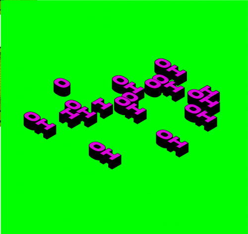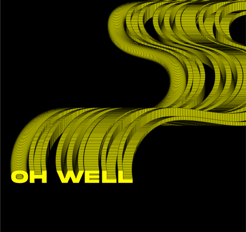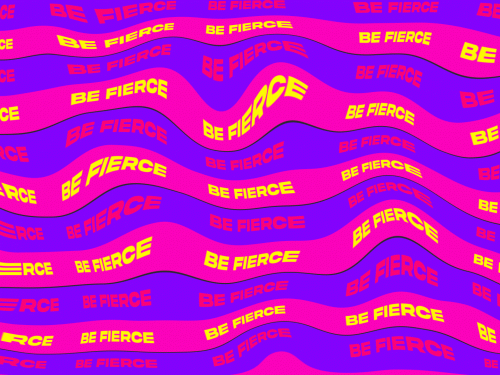
In response to the week’s theme of Rules and Forces; within the confines of the following guidelines
a)Typography must be used; b)Vibrant colors must be used; and c)Optical distortion must be present.
To generate visually appealing pieces, I created a series of random posters with vivid backgrounds and deformed writing. I wanted to see how type could be employed in novel ways.. I was inspired by Hansje van Halem who goes through who goes through continuous experimentation to implement intricate graphics tricks and optical illusions in her designs. https://wevux.com/hansje-van-halem0044478
About This Work
By Monique Kemboi
Email Monique Kemboi
Published On: 27/09/2021


