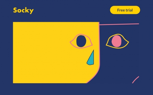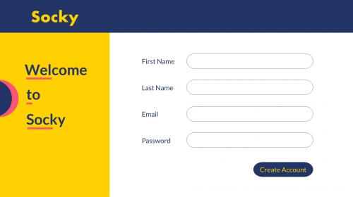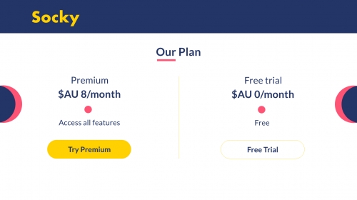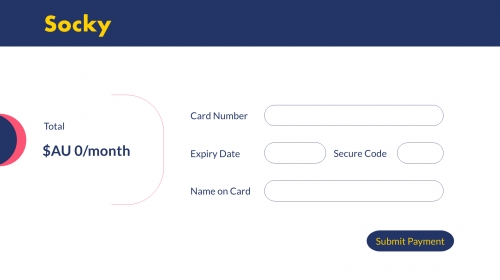
For the week 4 topic, Discussions of Place, I create a small UX-UI digital product to represent what I comprehended from the topic. Precisely, it is a web application prototype that I created with Adobe XD
Thinking about the discussions I have in class, I think it is suitable to refer to a UI interface as an environment that the users engage in. Based on the lessons that the environment can enhance or be hostile towards, this can also be applied to my idea. A UI interface with good user experience design will act as a protagonist toward the users. Vice versa, a UI interface with an evil user experience design will act as an antagonist toward users
I was recommended by Max to look into the topic of Dark Patterns in UX Design. Unlike a bad UX design, Dark Patterns are numerous tricks to deceive users to give the creators what they want. For example, have you ever need to give your email to a website to receive their free e-book? It may sound harmless but with your email address in their hands, the creators have been able to successfully take advantage of you without your notice. There are several types of Dark Patterns and with this particular exercise, I’m going to focus on Bait and Switch.
'Bait and Switch' is when you bait the users into doing something they don’t want. In this example, to sign up for the free trial, users will need to write down their bank details. Eventually, after a month or so, some users might forget that they are subscribing to the trial. They might end up getting charged for it. Users will then have no choice but to contact the website directly to ask for their money back. I also put in a little distortion on the price plan: the premium plan is put before the Free trial, the “Try Premium' button is in yellow to catch the attention of the users
The example I look at to take inspiration from is the infamous one taken by DarkPatterns.com itself: Microsoft tried to forcefully guide users to upgrade to window 10. On the panel, we can actually see Microsoft hiding the decline option away, and replace it with “OK”, ” Upgrade now” and especially, changing “X” to “Yes”. It is very sneaky of them


