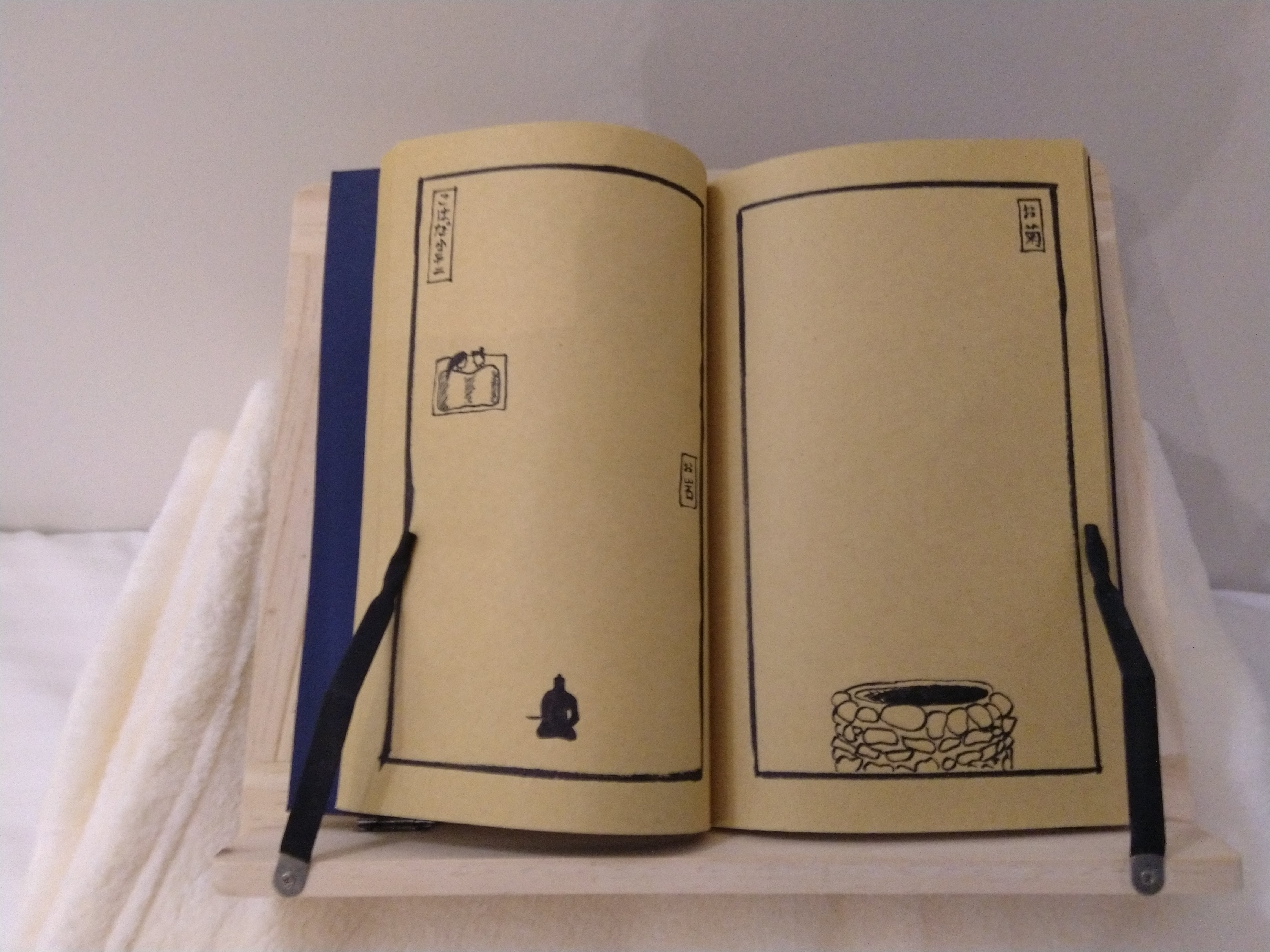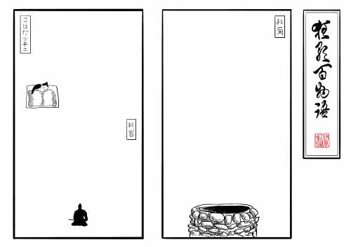
After showing the book illustration to Kate during the Week 11 WIP presentation, she felt it was too detailed. She explained how I didn't need such detailed, beautiful illustrations for the book pages as that will detract attention away from the ghost stories animations. If they were already so meticulously illustrated and an exact copy of what the animations show, why do we need the animations in the first place?
She suggested simplifying them down, or maybe just include a single component of it - e.g. just show the bed in the Koheiji illustration. Other classmates suggested kanji or symbols to represent the ghost.
I took this feedback onboard and redid my illustrations to just showing a single element:
- The Well - for the Okiku animation
- The Bed - for the Koheiji animation
- The Husband - for the Oiwa animation
Upon reflection, I'm glad I listened to Kate's feedback, as I quite like not having the ghost in the illustration itself. It's like the ghosts have gone missing, and the blank spaces arouses curiosity - what's supposed to be there originally? It'll also make the book glow projection much brighter (without having to map to dark outlines) and easier (as I only have to map to the borders). Win-win!
About This Work
By Helen Kwok
Email Helen Kwok
Published On: 21/05/2019

