Watch here:
https://www.youtube.com/watch?v=wmoX23XkjU4&ab_channel=PeterMavro
Context
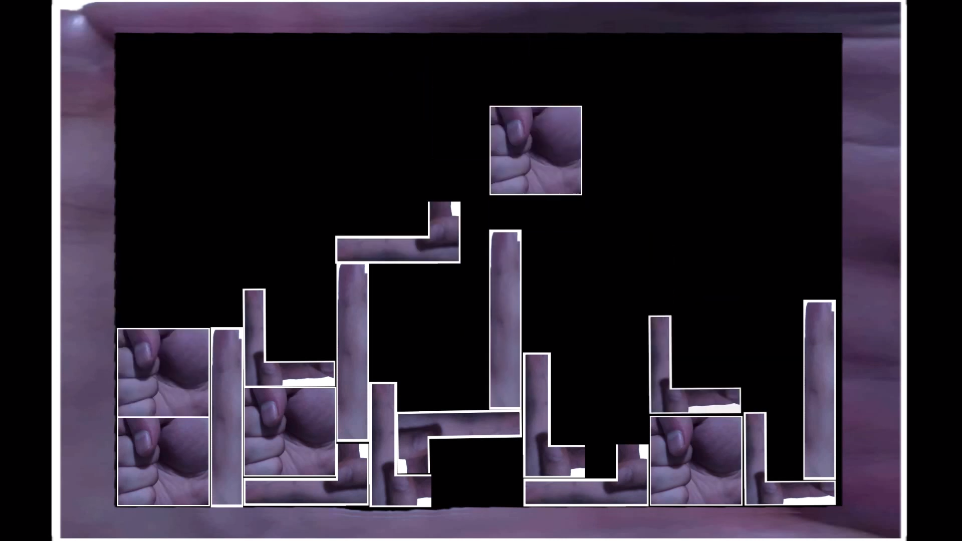
My work this week is heavily inspired by the original Tetris (Alexey Pajitnov, Tetris) and all Tetris games that came after that. I wanted to create a concept using the original game and use my physical hands and fingers for the artistic reasons. My work was also inspired by another student work by Stella Lin, also known as Yuxing Lin, for the response about Play and Place, where she used the city as Tetris pieces, of which at the time of seeing it I thought it was cool and it had stuck with me since. And thus, while thinking of my options for Play and Body , I came to this project. Brian Sutton-Smith lists many different types of playful behaviours, such as playing around, playing upon others, and putting something into play, etc. (Sutton-Smith, 2001, p. 4). While all the ones I mentioned in this quote apply, I just wanted to focus on the ‘playing upon others’ and ‘putting something into play.’ I have demonstrated both when I took reference from other student work and playing upon their idea but also by using the original Tetris game as inspiration too. By doing so I arrived at this concept. while incorporating play into body, I was intrigued by how hands signals can give off different meanings. “There is a fascination with hands and their expression of human behavior” (Kivell, 2016, p. 6). While considering this, I made the fist the cube shape as I wanted to show ‘rock solid’ such as the shape you would make in the game rock paper scissors. I used thumbs down to show you lose, etc.
Method
I got a family member to take a bunch of pictures of my hand on the wall. I made different poses and envisioned what Tetris pieces I could make with my hands. I made some extra stuff in case I would change my idea in the future. I then used Affinity Photo to cut out the parts I wanted from the various photos and then I removed transparency. I made shapes based on some of the existing pieces in the game that I found from a Tetris Wiki page (https://tetris.fandom.com/wiki/Tetromino). I made some of these pieces and added my own custom pieces too. I gave them all white outlines as I believed it made everything look nicer and for practical reasons that will be covered in response. I then moved to my video editor, HitFilm Express and set up how the scene would look at the end of the video and worked backwards from there. I did not want smooth animation in this video so while working back, I cut up the video slider, slightly moved the Tetris piece cut again and did those countless times until I got the whole video animating. I did not want to stop there. I wanted to push it a little more so I used some of the photos I took previously to make the start of the video which states the name of the concept game and some fingers that I was hoping would look like grass.
Response
For the week of play and body, I opted to use my hands as artwork for my project of Tetris. It was highly experimental and a challenge to make it look nice. I wanted to use my body for some sort of game, while I had other ideas such as the claw machines, PAC-MAN etc. I opted for this project as I could envision it a lot easier before I began production. And the thought of making a claw machine when you could you use a hand to win different body parts kind of frightened me. I explored how I could use my hands to show exactly that they are pieces and opted for the white outlines around the shapes. As this is a concept for a game, it had to make sense, if I did not do it then how would people know what shapes could fit? How would it be easy to understand? I had to consider this when making it. Through this project, I also experimented with a different animation style. I did not want smooth animation. I wanted it to look a little choppy just like the real Tetris game. I achieved this by cutting the image in the video editor and moved the piece slightly in the second image. I also saw that by having the picture still for a while helped to portray the feeling I wanted.
Reflection
Overall, I am happy with the outcome of this project. I experimented with a different animation style and learned a few new tricks when creating a choppier style. I liked that I was able to use my hand and fingers for the art. I will say that I do not think it looks super fantastic, but I believe a concept like this could work for another project in which I had more time. I regret adding the text “You Lose” as I could have just had my hand animating ‘thumbs down’. And by removing it, I would be able to say that this project was made exclusively with my hands and outlines. I do think that the text breaks the immersion a little too. But I am glad I was able to realise this and explore the animation realm further through this project.
About This Work
By Peter Mavromatakis
Email Peter Mavromatakis
Published On: 01/05/2021
