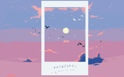
THEME
Play and Place
Please feel free to make your own polaroid sky! https://hiyokaygames.itch.io/polasky (pwd: magi)
Progress video: https://www.youtube.com/watch?v=t_b6hUUltmE
Context
While thinking about place, I remembered the various cases of people faking the place they were in for photos, whether it was through changing the entire background or simply dragging in an extra cloud for an added flair. I myself have used apps that lets you choose from an array of elements to make a whole new sky behind you.
For this week, I wanted to make something that would let the player make their own custom place, with a collection of elements that they choose to have inside the frame.
I looked out my window and wanted to see a different view from the gloomy clouds. So initially my idea was to have a window border with elements inside that the players could drag and place however they wished. I flipped through ideas of having different elements to symbolize weather, seasons, city or rural elements, but in the end, I decided to make it a sky in different stages of sunrise to sundown.
I was inspired by this one post, ‘Do you love the colours of the sky’ that I used to see on tumblr all the time, that showed the colours of the sky in different gradients. I was always happy to see that on my dashboard, even though it was rather long and took a lot of scrolling. I wanted to make people happy too, with this type of meaningless interactivity.
Method
I made individual elements in different layers with the intention of having them exist within a parallax. For instance, the layer of bigger stars is meant to be closer and thus move slower than the smaller stars at the back. The elements I decided to illustrate were based on my favourite minimal aesthetic backgrounds, with morning skies and city lights at night.
When I imported the elements to unity, I realized I couldn’t make a game object both parallax and draggable. I could have had some elements draggable that were not within the parallax but that’s not the effect I wanted. So, after a lot of trial and error, I figured out a way to have the best of both worlds, by making each layer draggable and putting them inside their own game objects and making that new game objects part of the parallax.
After I figured out the element aspect of the game, I wanted to focus on the sky. I wanted it to be scrollable but within a certain range, so as not to go out of bounds. I used a scroll view element and although it confused me a bit, I ended up getting everything set up exactly the way I imagined.
Response
I think this week’s response was my personal favourite and it invoked a kind of passion in me that I haven’t felt in a while. I think I really like being able to move things, customize and make it my own, and I want everyone else to be able to do that too.
My one regret was that I wasn’t able to add all the elements I had wanted like jellyfish, flowers, ships and city lines that would’ve let the player be more creative with their vision.
References
‘Do you love the colours of the sky’
People Are Faking Vacations On Instagram Using Photoshop
#kaykay #kkapd4
