My response for week ten of Animated Narratives
This week of Animated Narratives focused on the use of light and how it impacts on an environment or characters.
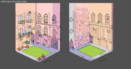
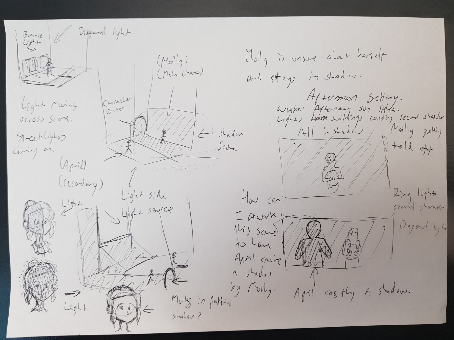
In my studio project I have a setting where half the scene is in shadow and the other half is in light. This corresponds with two characters, one who is confident and arrogant and the other who is nervous and unsure about herself.
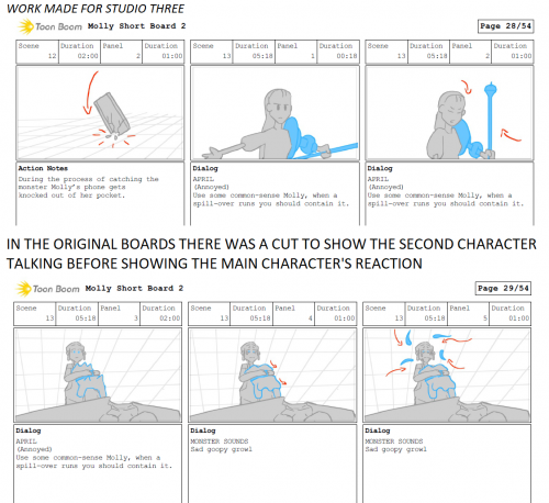
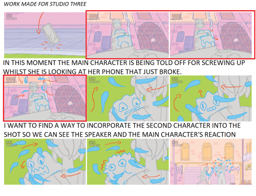
Looking at the use of light during today’s class I started thinking about one moment in my project where this main character has just messed up and is feeling terrible about herself, whilst the other confident character is berating her.
This comes at a moment where the main character has just made a mistake but has also dropped and smashed her phone. So the combination of being told off and seeing her phone broken causing her to break down crying. Originally I had boarded it so that we see the phone break, cut over to the confident character to see her annoyed reaction, then come back to the main character to see her emotions as she starts to cry.
This felt wrong to me. Having the moment where we see the confident character getting annoyed and starting to berate the main character was a break in the action. It felt more correct to keep the focus on the main character and connect her emotions with the broken phone.
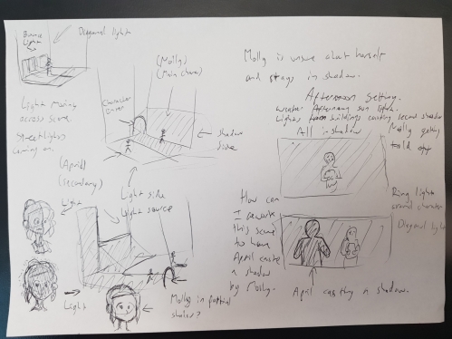
Thinking about the use of light it occurred to me that I could cast a shadow of the confident character and have it appear along the wall behind the main character. This would allow them both to occupy space within the same shot. The issue presented here is that the main character is already standing in the shadowy area, and technically the light source would be off to the side of both characters, so nothing is really behind the confident character to cast into the shadowy area. If I did move the light source behind the confident character then I would have to rework the environment to figure out how she could be looking towards an area covered in shadow. Something like a billboard in the sky behind her, casting this specific block of shadow but still letting light in around it.
During the in class group discussion other ideas were presented to me. Such as setting the story in the afternoon and having a weaker sunset light and secondary lights from buildings to cast a second shadow. Or perhaps move the source of the sunlight and have it bounce off the building behind the confident character to cast that shadow. Or even moving it around a little so the light is coming in on a more diagonal angle and the main character is lit half in shadow and light.
Of course, given that this is a 2D animation and I am in complete control of the light source I could just cast a darker shadow into a lighter shadow for visual effect without worrying about how that shadow is being generated. This is something I noticed during the in class example of The Lion King (The Lion King, 1994) in the scene where Scar is explaining his nefarious scheme and all the visuals are built to symbolise a fascist military parade. As the hyenas are marching along in front of Scar they are casting these gigantic rectangle shadows onto the wall, however they are themselves in shadows with no backlighting that would indicate how these shadows are made.
This seems like one of those moments as a director where I worry about every detail, but in reality the audience won’t notice if thematically and emotionally it makes sense.
The Lion King. (1994). Directed by Roger Allers and Rob Minkoff. Walt Disney Pictures, USA.
About This Work
By Maxine Gorey
Email Maxine Gorey
Published On: 11/05/2021
