
Work 1: Persona5
- Persona 5 is a very famous JRPG. It has very interesting and creative mechanics.
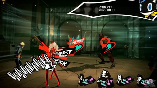
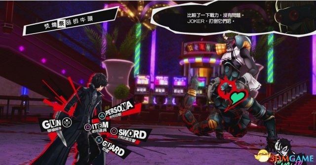
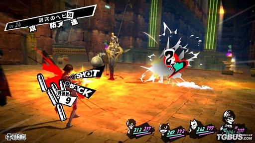
- Persona 5 has so many advantages but what impressed me most is its UI design. The UI of Persona 5 is very open, wild and unique. It looks mess (All UIs are not in a neat layout) but clear (Player can easier find what they want and what they can do from screen).
- I still remember the first time I saw the battle scene in Persona 5. It is so impressive. There’s 2 parts that I liked very much. The first part is how its present enemies’ health bar. P5 use a dynamic green heart near the enemy. It looks cute and tiny. It does not take much of space but directly shows player it is a health bar. Second part is P5 use many texts rather than icons. Comparing with Monster Hunter World, it will show a star next to the damage number if player deal a critical damage. I have seen so many posts that ask what that start means. But in P5, it will shows text with damage number which directly tells player that they have made critical damage.
About This Work
By Sdust
Email Sdust
Published On: 03/05/2020