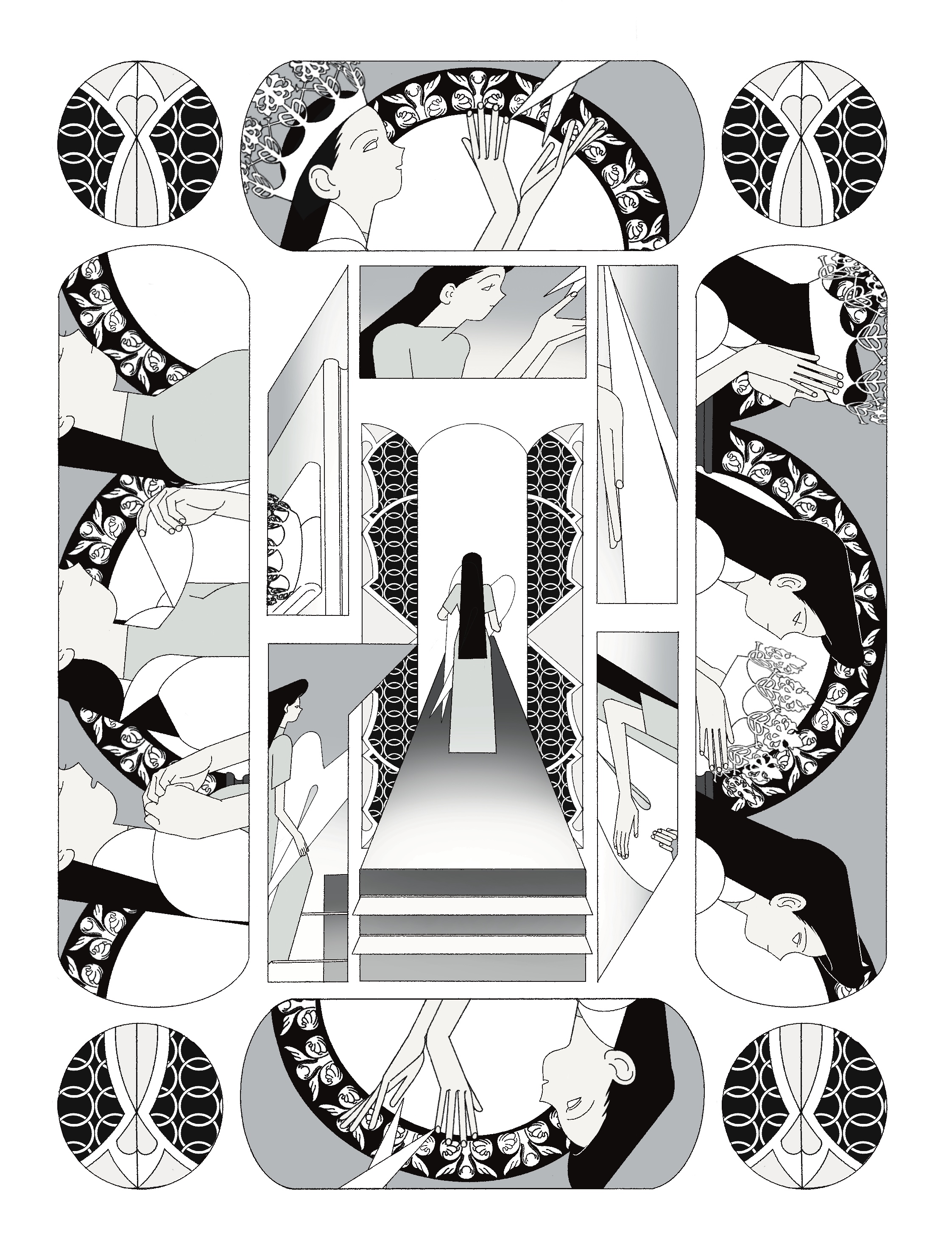
The following pictures are from my Studio 3 project. Through these pictures, I tried to explore the role of layout in plot expression and how to visual guidance.
The first picture tells the story of a girl who gets wings and then takes off the crown and cape and walks to another space. In this composition, I try to use spiral expression, and the reading sequence is clockwise from outside to inside. In the process of painting, the plot in the outermost circle happened first, but I designed the shape of the Panel to be symmetrical, so the sequence of the story in the outermost circle does not affect the final result. The shape of the Panel in the second circle is directional. It can be seen from observation that the reading order is clockwise. The last Panel points to the center of the picture, which is the result. Through this work, I want to try to change the Layout design to let readers explore the plot of story and get their interest through the exploration.
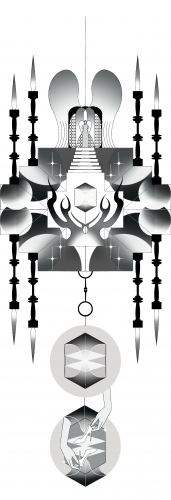
The top part in the second picture is an overview of the scene, and I designed the scene to be symmetrical to let it looks more orderly and dignified. The props that are going to start the next scene are placed in the center of the picture to get interest of the readers, and the visual concentration is enhanced by the contrast between the white space around the props and the light and shade of the rest of the scene. The rest parts in the picture are two panels which It can be regarded as the process and result of opening the props, and make corresponding explanations to the readers after being attracted to the attention.
About This Work
By Rui Liu
Email Rui Liu
Published On: 30/09/2021

