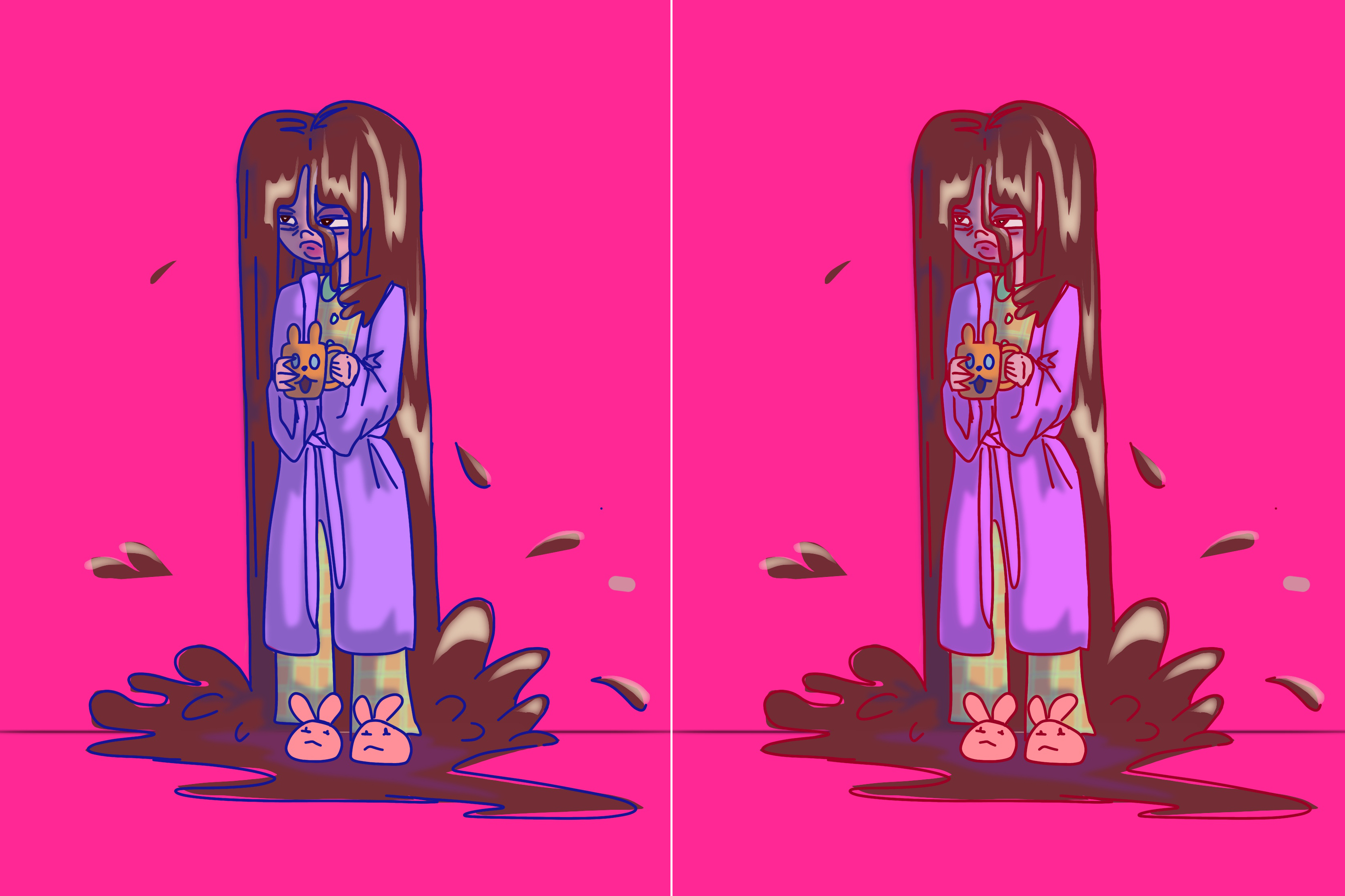
One of my OCs (original characters) that I developed last week from an animated narratives exercise has become one of my favourite characters. I used the basis of Coffeehead to produce this digital painting.
I made these images in Procreate. Something that I wanted to explore in this practice was my use of colour, and how use of colour can evoke a feeling or reaction. I experimented with 2 palettes as seen in the image: a Blue and a Red linework pattern.
When I asked friends and classmates about their thoughts on how the two images made them feel, most preferred the Blue image. The reasoning was that the image was clearer to make out, and in one case more 'lively.' Someone preferred the Red image, saying that the effect was mysterious, surreal and interesting.
In the context of an animation, this feedback tells me that using unconventional practices, like choosing a line colour that deviates from conventional art forms (the red linework) will evoke a different reaction to something more conventional like the blue linework.
I personally prefer the red linework, because it is different to what I normally practice. I love warm colours, and the effect for me is warming, bizarre, and edgy.
About This Work
By Hattie Read
Email Hattie Read
Published On: 10/03/2020