Week 7
(Response written collaboratively by Holland, Amber and Harry.)
THEME: Play and the Body.
CONTEXT:
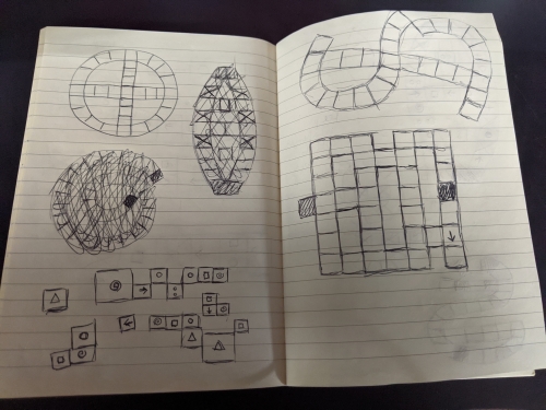
Many of Skit's ideas originated from game design concepts that emerged during Amber's and Holland's work during Play and Objects in week 2 on Boardgames, but were also heavily inspired by ancient social street game hop-skotch that we grew up playing and seeing on playgrounds as kids.
We were also inspired by gameplay devices from Reyn Guyer Jr's 1964 physical skill game "Twister" and its concept of using the human body as a game piece and elements of Helen Kwok's "Street Tape Games". As the game developed, we incorporated Harry's ideas for encouraging stretching in the upper body and back during breaks from computer work.
METHOD:
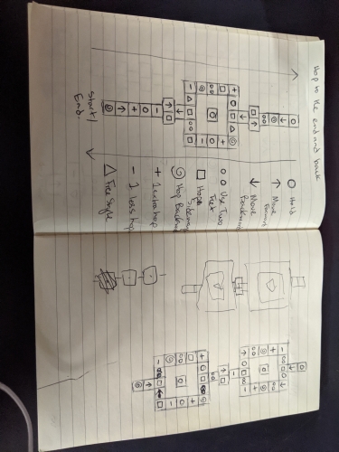
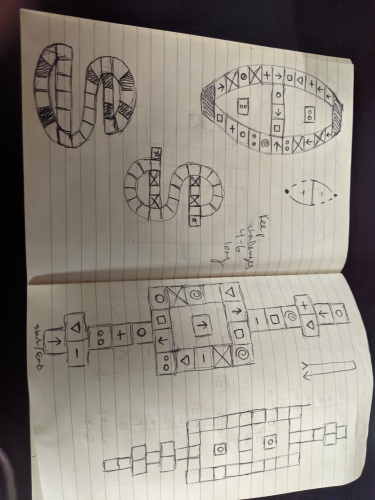
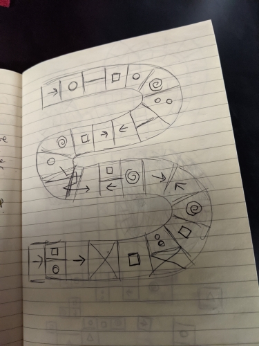
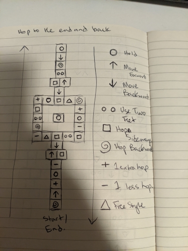
Refine a Hop-skotch like concept over group chat with outlines, rough rules and multiple symbol languages, adding and removing ideas but leaving lots of options in.
Develop a website with a digital dice and a basic set of rules which can be changed later.
Plan out the game route and then build it with tape and chalk.
Playtest with RMIT students in public and distribute prizes.
Document these experiences and Gather feedback.
RESPONSE:
We aimed this week to create a game which would continue to build on our growing understanding of board game design, which disrupted a public space with a novel invitation to play, which invited the player to enjoy the interactive process of rulemaking, which plays with chance and which ideally incorporated as much use of the body as possible in order to engage the office student's bodily needs, but without falling into the potentially ableist trappings of a game like Twister.
The default game has the following rules.
At the beginning of each game each player scans a QR code and opens up Amber's website containing rules and digital dice.
The players decide on actions to undertake when a player lands on each of the three colours. These could be anything physical or verbal. (Some examples from play testing include Sdtarjumps, the Floss dance, making a specific funny gesture and shouting a phrase.)
Starting at either end of the board, ideally all at the same end, a player rolls their digital dice and hops with one foot the number of spaces. They land on a space and go the action associated with the colour.
The space also has a symbol. In the default game,the symbols designate exactly how they will be allowed to hop on their NEXT turn. (These ways of hopping include: only being allowed to hop in a certain direction, having one less hop than your dice roll, having one more hop added to your dice roll, hopping sideways, hopping backwards, hopping with both feet, and skipping a turn). At the start of their next turn they will roll their dice, look at the space they're on and hop according to that symbol for the duration of the turn.
The first one to the end of the board and back wins. You must roll exact numbers to get to land on the finishing space.
REFLECTION
This work was influenced by Amber and Holland's works on Dr Stitchenstien 's House of Horrors and Momento and Harry's eye for digital interactivity. The website was built by Amber but everything else was a group effort compiled of all our ideas. Also our backs all hurt and we needed a way to stretch.
A key element of this work has been encouraged player agency. In order to create a public work for students to use, you need it to be accessible, relatively simple and self explanatory. This was part of the reason we incorporated a website with a simulated die, as 80% of Australians carry mobile phones at all times. The recognizable language of hop-skotch is used as a base and then the added details can be interpreted however the player wishes on top of that base. That way, when the game is left alone in public, everyone from wheelchair users to primary school students to powerlifters can play. This is similar to the psychology behind a lot of playground designs we came across while researching.
As such, a big part of the works interactivity is its making rules and then exploring how those rules interact within the existing structure. In the default version game that we triled, we had some more rigid rules and some looser rules. Players were free to decide what actions to perform on what colours, but were also challenged by the movement rules of the symbols and must use their body creatively in order to meet those challenges. In other words they are moving constantly between exploring their relationship with the space and altering their relationship with the space. This is similar to the dichotomy Costello and Edmonds describe in "A Study in Play, Pleasure and Interaction Design" (2007). Of the pleasures of interactivity described in the essay, this work leans more towards the "Pleasure of Being A Cause" as it encompasses Creation, Exploration, Difficulty, Competition. In some ways it also evokes the pleasure of Camaraderie as well, as the player and the hypothetical game designer have built the game togeather, and in our case literally played it togeather. The connection to these "pleasures" in particular says alot about the games inclusion (and even reliance) on Player rule input. Rule-making can also be somewhat of a chore though, which is what the default rules help alleviate. The game is also adaptable to the point where the symbols and colours can be ignored and one can simply use it as a giant Hopscotch.
The main type of interactivity in the game is the use of the body as a game piece. Bodies have so many output methods, unique limits and talents that they fit well with this loose rule-making style. Also the novelty of basically playing a human sized board game has its own distinctive appeal. The challenges and rewards of the game are each impacts on the body. The player interacts with the board, only via their body, making decisions on which route to take based on what potential bodily challenges come with it (according to the symbols) and is always rewarded with a bodily movement of their choice when they land (according to the colours). As such the body becomes its own kind of game system. The board could change shape or symbol order or colour, but the consistent rules of the game are within the body of the player, which is not only its own controller but its own rule making system, eg: "I can jump that far","I can't balance for that long" "I can jump backwards only if I angle my body like this." "I would enjoy making this gesture."
Other types of play we explored this week include social play. The interplay of several players deciding on rules together, making eachother laugh with gestures and competing against one another was a key part of the game's appeal. This is interconnected with it being a public performance among unknown fellow students. Regardless of the presence of us as designers and the focus on competition, there was also collaborative play in the sense that no player wants to see their friends falling over or having a bad time. Test players consistently wanted to have fun with people they already knew and bonded with new people while playing. Socializing became an important part of the final game.
Another emerging type of play was playing with chance. The final outcomes of the game relied on dice rolls on the app turning out ideal numbers as you have to land directly on the finishing square to win. This gave frequent surprise results as sometimes someone lagging behind won seemingly out of nowhere with a perfect score, and others who were way ahead spent five minutes trying to reach the end. Dice rolls, combined with the players chosen route, also randomized the symbol and colour effects they would have to perform. The anticipation felt by players unsure of what outcomes to anticipate was also a type of engagement that encouraged the volunteers to keep playing and find out what happens next.
About This Work
By Holland Kerr
Email Holland Kerr
Published On: 28/04/2021
