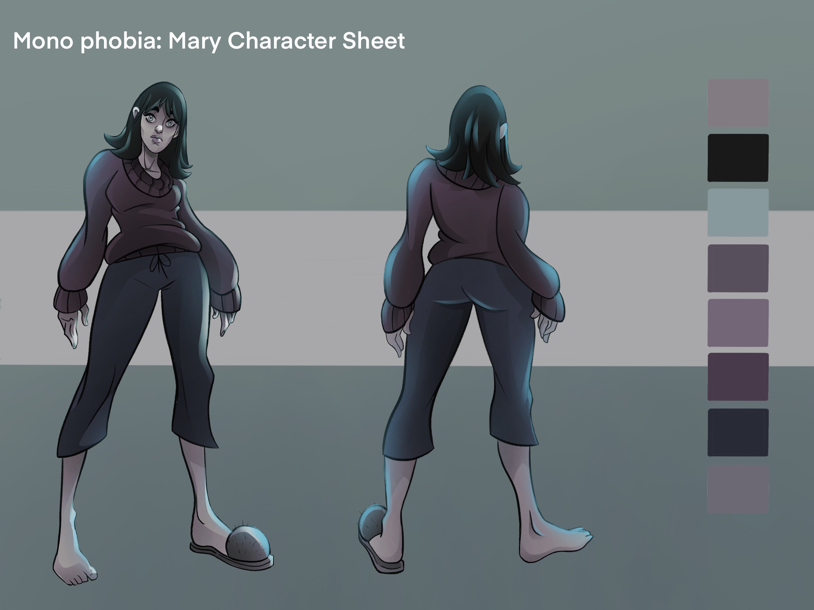

This work highlights the use of light in narrative and character design. Although my final submission for this deadline will be an animatic and therefore not include any final polished art, I wanted to present the concept of the lighting and character design to translate the art direction I envision for the complete piece. The use of light is so essential to creating atmosphere in the horror genre that I wanted to discuss my personal approach and application of it’s method.
My main goal art direction wise is to create an ethereal atmosphere with visual themes of glass, rain, ice and sharp cold. To achieve this through lighting and colour I have focused the colour theory approach on desaturated greens, blues and greys. The stark contrast of a bright, almost neon blue is used to signify an uneasy feeling creeping in, with the hope that the physical representation of this is reflected on the audience, who in turn may feel a “chill” or a sense of physical discomfort. This is similar to the feeling of looking out the window on a cold day and having a “phantom pain” of the discomfort you might feel if you were outside.
Traditionally the colour red is used as a lighting trick in film to signify danger or violence, In my example though, I feel this would create a feeling of warmth, comfort and relief - the opposite of what I wish my audience to feel. To maintain the constant feeling of dread and discomfort, I intesad have elected to enforce and focus on the colour blue, increasing its use in particularly tense sense and lighting the character and her environment so that subconsciously the audience begins to feel, suspect and empathise that something is not right. This feeling of discomfort through lighting is an essential technique (complemented by sound and direction) that is at the core of the uneasy atmosphere I wish to create.
This technique of lighting using a single colour to elicit a feeling in an audience is done masterfully in “Perfect Blue” by Satoshi Kon. In which the colour of red bleeds into the film over time before bathing the world and characters in it. This use of red coincides with the main character’s mental decline and communicates to the audience that danger, madness and violence are seeping into the world of the film.
The use of red in "Perfect Blue" analysis
Further inspiration of This technique and using lighting ,desaturation and colour (or lack thereof) to create a world of unrelenting dread is also present in Team Silent’s game “Silent Hill 2”
Downloads:
-
Download File: 1620884860_photo-12-5-21-5-36-26-pm.jpg
About This Work
By James Elms
Email James Elms
Published On: 13/05/2021