This week I reviewed gameplay of critically acclaimed game sprite animations.
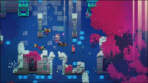
Hyperlight Drifter is a 2016 topdown 2D RPG by Heart Machine. It features "The Drifter" the only character with ancient technological powers and a magical sword, taking on a series of elaborately animated and deadly monsters.
The game's sprite animations are oriented around the normal natural world vs the magical ancient world. The character can softly run and turn with a series of minute actions indicated by nearly imperceptible differences in the opening of their cape, or they can swipe, strike and dash in 40 pixel bursts, so quickly the sprite is smeared for a moment. To help these animations read well and to distinguish the natural from the magical, the creators intelligently include a streak of neon light after the sprite's body and a different one after their sword after the use their powers. The animations are detailed and each enemy has a different movement speed and style, but despite the neon aesthetic and the frequent moments of 20 or so enemies at a time, the screen doesn't feel crowded or visually exhausting. This, I think, is because the sprite designs are simple and small on screen, and the movements in their animations, while detailed, are small in span. The movement style of slow detailed movements or quick smeared movements applies also to inanimate objects like smoke, which shoot out from open grates and then beautifully dissipate. The consistent movement style lends a distinctive atmosphere/feeling to the entire game.
The pixel style is reminiscent of Superbrothers: Sword and Sorcerer (2011) a refined, developed pixelation style which is free to pick and choose which elements of 32 bit style it wishes to leave simple and which it wishes to upres. According to its creator, its world building is also based on Nausuca and the Valley of the Wind.
Hyperlight Drifter made me reflect on my sprites size relative to my frame, and given how detailed I aim to make my final animations, how much visual noise I really want on screen at a time.
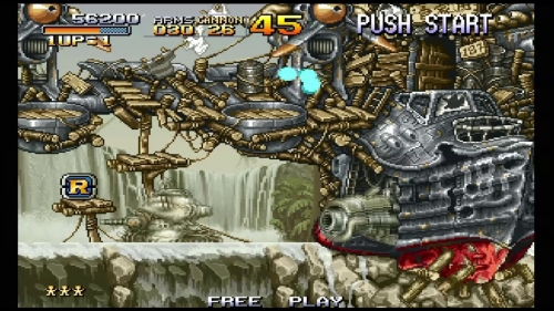
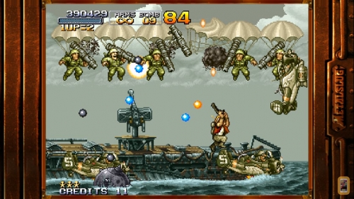
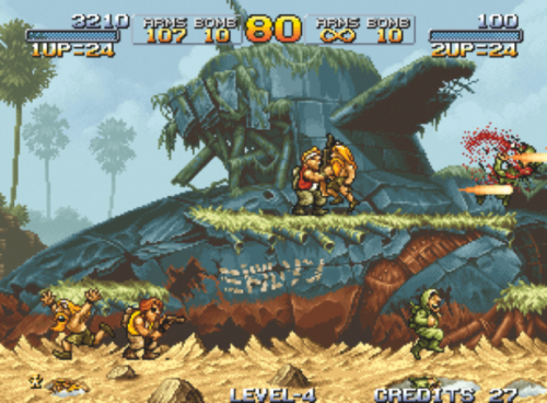
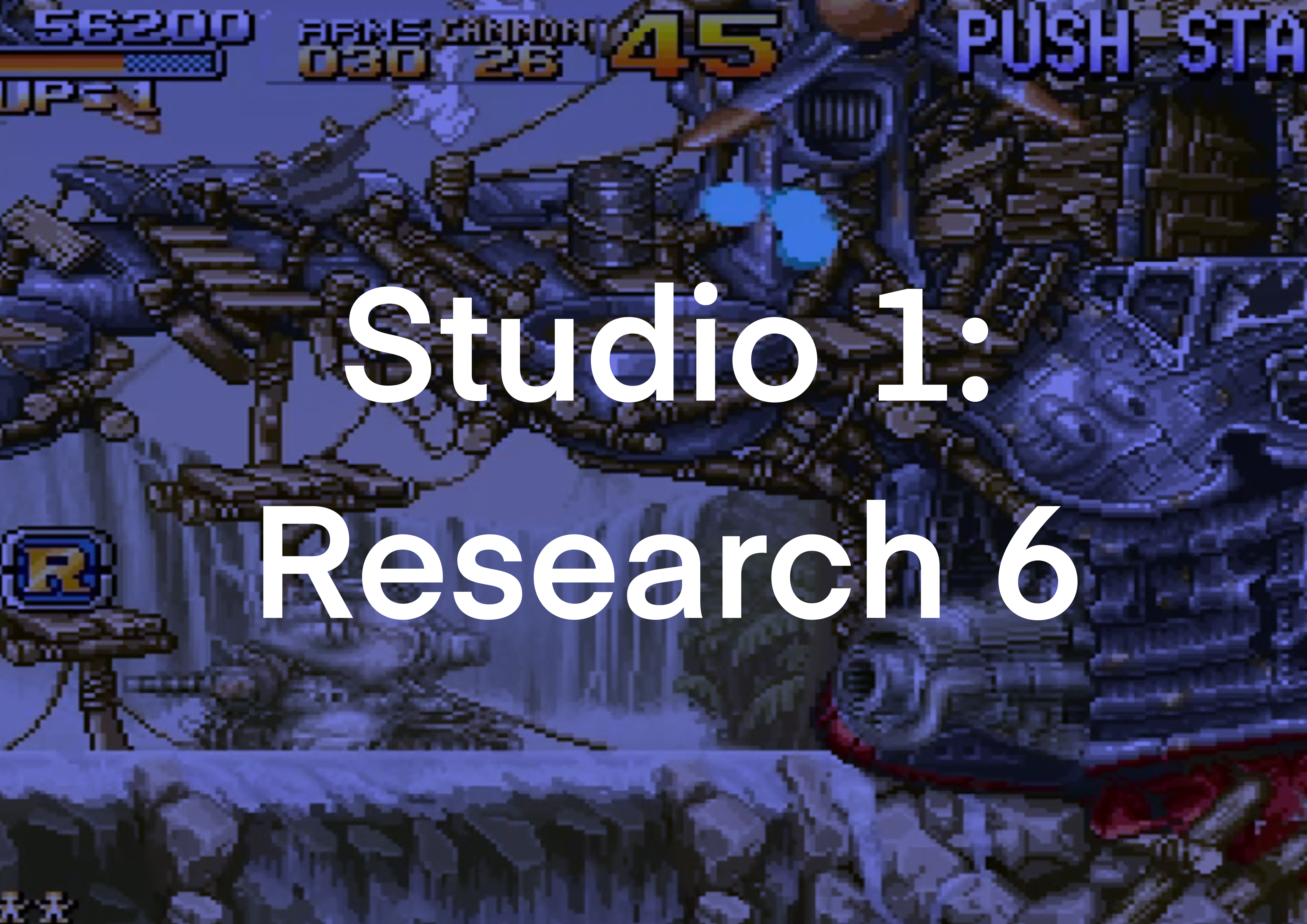
Metal Slug 1 (1996) is a 2D run-and-gun side scroller game about a marine cadet fighting waves of terrorists and defeating progressively larger super-weapons.
Metal Slug is a violence spectacle piece, aiming to surround the player with as much violence as possible both visually and audibly. It’s brand is to be bombastic, cartoonish and violent without being mean spirited or too much to sit through. As much, everything about its sprite animations is over the top. Every action is noticeably anticipated and has followthrough. Every Large action has secondary actions (The tank bobs up and down as it moves, its camera and antenna bobbing secondarily).The facial and body expressions are loud and exaggerated, almost like mime artists, and there are at least 5 enemies on screen at any time with a max of about 20. When firing his gun the player character jerks his entire body up and down following (or even anticipating) the force of each blast.
What I particularly appreciate about Metal Slug is the ways in which the prefab sprite movements meld with the coded in game physics movements. When our protagonist sneaks up and shoots a guard character, the force of the blow causes the victim to go flying and then skid across the floor. An enemy fired at with a rocket launcher leaps up and falls like a Mario death, but unlike In mario, the physics of his body move in sync with his fall. The followthrough of the animation is planned across multiple types of animation and I deeply admire the amount of planning that went into making the work so evocative and expressive.
Watching the sprite animations in Metal Slug made me consider the workflows by which I integrate in game and sprite sheet movements and also how important classic animation principles are in sprite creation.
About This Work
By Holland Kerr
Email Holland Kerr
Published On: 20/09/2020

